The new version of social bookmarking site Delicious launched last week and overall I'm impressed. Search is snappier, the design is slicker and they didn't ruin it by taking out nerdy features like tag intersections. Delicious and Wikipedia are the only two sites that give Google a run for their money for search for me so I'm happy to see it treated well.
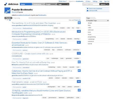
That being said, there were a few UI decisions I didn't care for and have created a Greasemonkey script to fix. Here's the before:
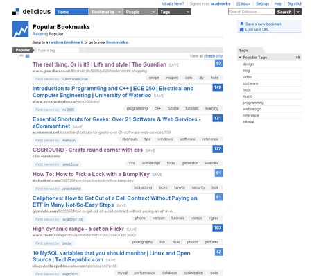
And here's Delicious with my tweaks:
My changes are:
- I bolded the link titles. I found them too hard to skim, which is largely what I do on Delicious.
- I turned the link URLs a light grey. For some reason the URLs were the easiest part to read for me and also just about the least important information.
- I coloured visited links purple. At least to my eyes, visited links on the new Delicious are only the slightest bit fainter than the regular colour. This makes it hard to know at a glance which links you've already visited, which is a pain especially when you're searching.
There are a few other changes I'd love to make, but my Greasemonkey skills are not the strongest:
- Tags should be moved to the left. They're the third most useful information to me (after titles and a description – which often isn't there), but your eye has to travel to the right to see them.
- Make the link counts easier to skim. The shades of blue they use for say, numbers 17 and 794 are barely different from each other. When I'm searching, I want to quickly know what the most popular links are.
I may get used to these issues, I'm a pretty fussy dude. But it's been a few days and I still find they slow me down. Anyway, it's still a good redesign and congratulations to the team for transitioning to it smoothly. There was no downtime that I noticed and the new site hasn't lost any functionality that I enjoyed before. Good stuff!

